As a designer, you take great pride in getting every little detail of your work just right. You want your creation to look perfect, exactly the way you designed it.
If you’re designing digital art that will be printed, the process is slightly different than designing for the screen. Colors are displayed differently with ink on paper than they appear through the light of a screen or monitor. If your files are not properly prepared for the printing process, you’re likely to be disappointed when you see your work in print and it’s not exactly what you were expecting.
Preparing a digital art file for print can be a little confusing at first, but it’s really not that complicated. There are a few key details that need your attention, and once you understand these basic concepts, you’ll be able to prepare your designs like a pro. The end result is that your work will look exactly as you expect whenever it is printed.
Follow the Instructions of the Printer
The most important thing you need to do when preparing a digital art file for print is to exactly follow the instructions and recommendations of the printer. There are many different companies that you can choose for printing your work, and every printer will provide you with instructions that dictate how you should prepare and submit your files. It’s critical that you follow their instructions because they know the equipment and process they use, and they want to help you get prints that you’ll love.
You should receive instructions from the printer related to:
- Color space (CMYK, RGB)
- Resolution (dots per inch or DPI)
- Bleed
- File format
We’ll touch on all of these details in this article.
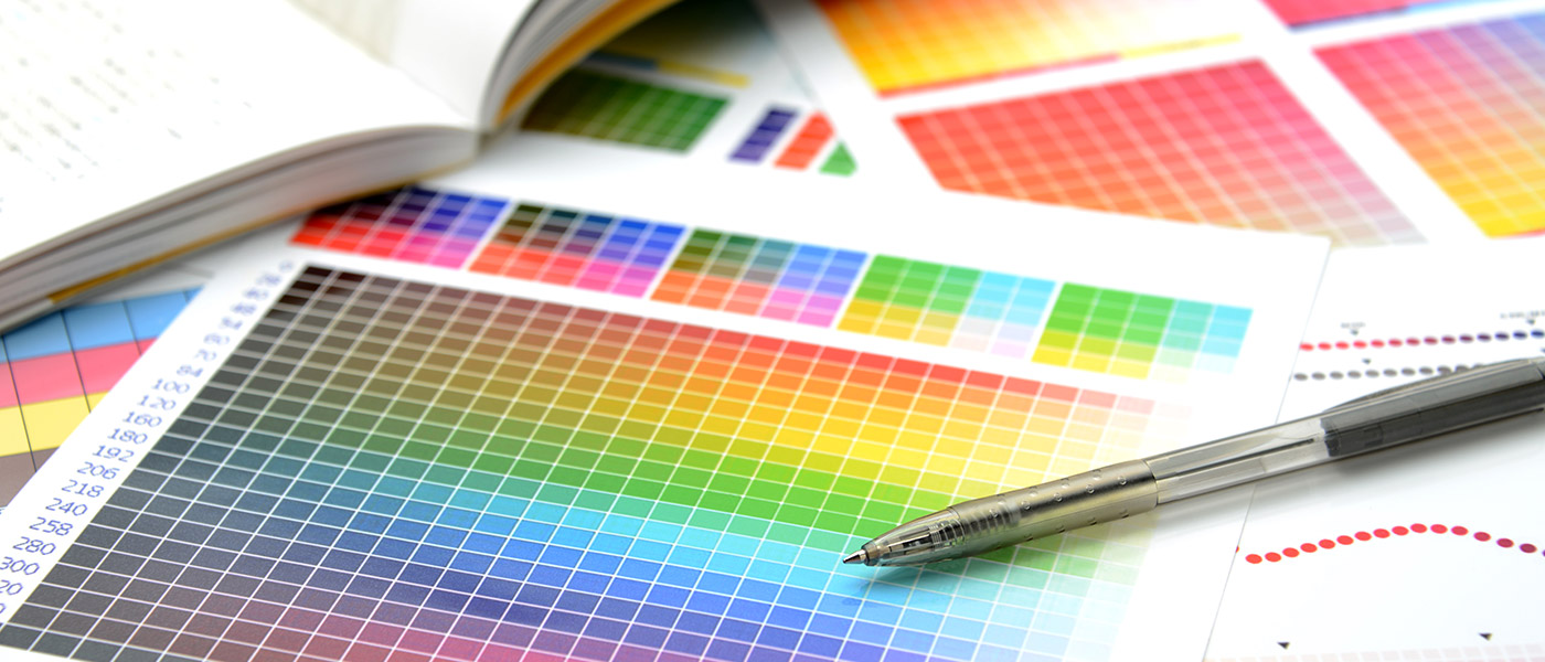
Color Space

CMYK Image by Sebestyen Balint
The two most common color spaces that are used in graphic design are RGB and CMYK. RGB stands for Red, Green, Blue and is typically used for designing things that will be displayed on a screen. For example, if you’re designing an image to use on a website, it will probably be saved in RGB.
Get millions of stock images and videos at the best price
Unlimited access. No attribution required. Starts at just $9/month.

CMYK stands for Cyan, Magenta, Yellow, and Black. “K” is used for black instead of “B” to avoid being confused with blue. CMYK is the color space commonly used for work that will be printed.
In most cases, the files that you’ll be printing should be designed and saved in CMYK. Even when you’re working in CMYK, the colors that you see on your monitor are only a close approximation of the colors that will appear on the paper when it is printed, but it will be as close as possible.
When talking about color space it’s also important to understand color gamuts. The color gamut is the full range of colors, and RGB’s gamut is different than CMYK’s gamut. If your printer asks you to send your files in the CMYK color space and you send an RGB file instead, the colors may seem off to you when it is printed. That’s because your RGB file may include colors that are outside of CMYK’s gamut and those colors will be replaced with a close substitute. However, the color that is substituted may not be exactly what you would want and the difference may be noticeable.
If you convert your files before sending them to the printer, you’ll be able to see (as close as possible) how it will actually look when printed.
Related: How to Get True Black in CMYK
Resolution
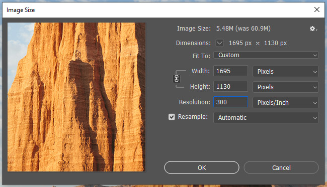
If you’re working with vector files, the resolution will not be an issue. Resolution only applies to raster files (learn more about the differences by reading raster vs. vector).
Resolution is measured in dots per inch (DPI). In some programs like Adobe Photoshop, it will be listed as pixels per inch (PPI). Either way, it is the same thing.
The resolution determines how tightly the pixels are packed into the image and it can impact the quality of the printed image. Many printers will ask to receive files that have been saved at 300 dpi, which produces a high-quality print where the pixels are not visible to the naked eye. An image saved at 150 dpi might not look quite as sharp when printed because it does not have the same pixel density.
If you’re not sure what resolution to use, going with 300 dpi is a safe choice. However, follow the instructions of whatever printer you are using.
Bleed and Safe Zone
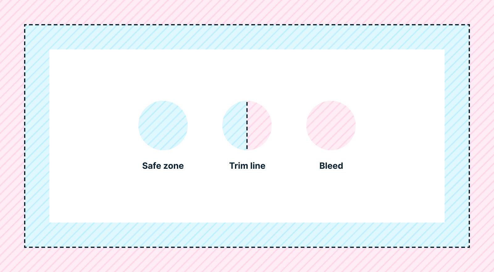
Digital files for print will usually include what’s referred to as a “bleed”. This means that the design and colors extend slightly beyond the dimensions of the area that will be cut. The process of printing and cutting is not always 100% accurate and if your file does not include a bleed, there may be a thin white line at the edge where the design ends. The bleed essentially leaves a small amount of room for error so the finished product will still look great.
Crop marks are very thin lines that indicate where the item should be cropped or cut. If you’re using crop marks, they will be inside the bleed.
Because the cut or trim could be slightly off, it’s recommended that you keep text and any important details spaced away from what is referred to as the “safe zone”. If the text gets too close to the crop marks, there’s a chance it could be partially cut off.
When you’re preparing your files, be sure to follow the printer’s instructions related to bleed and crop marks in order to ensure the best results. The size requirements for bleed and safe zones can vary depending on the printer and the size of the item that is being printed. For example, the bleed might add 1/8” (0.125″) to the height and width of the document and the safe zone might be 1/8″ (0.125″) inside the crop marks on all sides.
Related: Standard Sizes for Business Cards, Brochures, and Flyers
File Format
Your printer will probably provide a list of different file types or formats that you can use. Be sure that you’re saving your files in an appropriate format that the printer will be able to access.
If you’re working with a vector file that includes text, the printer may or may not have the same fonts that are used in your file. If you save the file as a PDF, you’ll have the option to embed fonts into the file. This can help to avoid issues that may arise if the printer doesn’t have the font.
Another way to avoid potential issues related to fonts is to outline the text. This will convert the text into a vector format so it can be viewed properly even on computers that do not have the font installed. To do this in Illustrator, go to Type > Create Outlines. It’s important to note that text cannot be edited after it has been outlined. You’ll want to save two versions of your file:
- Save a working version before the text has been outlined
- Save a version to send to the printer with the text outlined
Conclusion
While preparing a file for print is a little bit different than designing for the screen, it’s simple once you understand these basic concepts and keep them in mind as you’re preparing the file to be printed. If you have questions or you’re unsure about any details along the way, reach out to your printer and ask for their instructions. The printer wants to provide you with an end product that you’ll love, so they’re usually very willing to make sure files are set up properly ahead of printing.