
Lettering is an art form that can enhance the aesthetics of your design. The difference between lettering and fonts is that lettering is usually custom-created for a specific project. Rather than using a standard font, you can use custom lettering styles to match the exact style or personality of the design. You can also adjust letters as needed to fit within the confines of the design. This can be done on paper or digitally.
Of course, fonts can be created to mimic the look of custom lettering or to replicate a specific style.
Whether you’re designing a logo, poster, or packaging, lettering can bring life and personality to your work. If you’re unsure about which style of lettering will best suit your project, here are seven styles for you to choose from.
Lettering Styles Overview
1. Brush
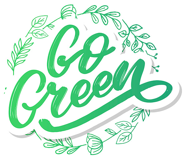
One of several hand-drawn lettering styles, brushed letters typically feature brushstrokes that are clearly identifiable within the letters. For example, in the image above, the white areas within the letters make it evident that it was created with a brush.
Brush lettering has a very natural feel thanks to imperfections, and it also adds personality. This style is an excellent choice for branding, package and label designs, apparel, social media images, etc.
→ Find resources at Vecteezy with brush lettering.
2. Script
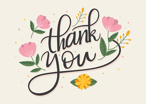
Script is another style of hand-drawn letter, typically using cursive letters. The fluid and flowing strokes may be in varying widths from thick to thin, similar to calligraphy.
Get millions of stock images and videos at the best price
Unlimited access. No attribution required. Starts at just $9/month.
Use script lettering when you’re after an elegant look or to create something that feels personal. Script lettering is often used on invitations, cards, and other items that need a personal touch.
→ Find resources at Vecteezy with script lettering.
3. Serif
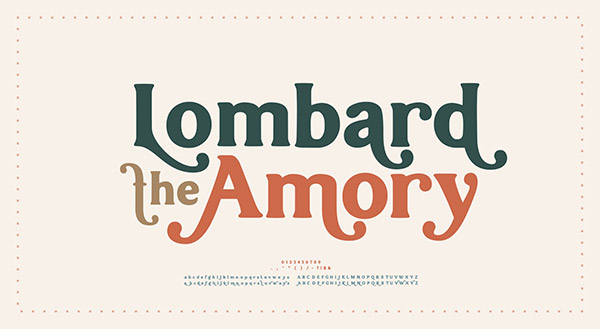
Serifs are the small lines or strokes at the ends of letters, or the decorative “feet”. Letters or typefaces that include these strokes are classified as serif. Serif letters have a more formal feel, and the serifs can be used stylistically, as you can see in the image above.
The professional and sophisticated look makes it one of the best lettering styles for branding, headlines, and body copy. Serif lettering is often considered easy to read, which is why serif fonts have always been popular for printed materials like newspapers and magazines.
→ Find resources at Vecteezy with serif lettering.
4. Sans Serif

Sans serif letters lack the decorative feet used with serif letters. Instead, they typically have a clean look that makes them easy to read.
There are many ways to use sans serif lettering. It’s one of the best lettering styles for text that will be viewed on-screen. While serif fonts are popular for body copy in printed materials, sans serif is a more typical choice for body copy on websites, apps, and anything else that will be viewed on a screen.
Sans serif letters are also effective for pairing with other styles of letters. Because sans serif letters are clean and simple, they complement script and other styles.
→ Find resources at Vecteezy with sans serif lettering.
5. Block
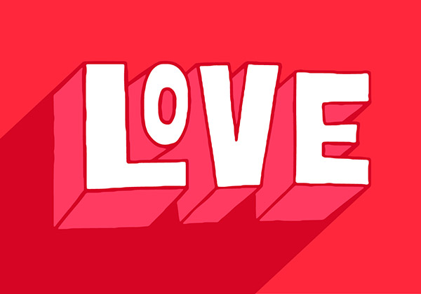
Block letters are typically thick, heavy sans serifs. In the case of the image above, there’s a 3D look, but that’s not always the case with block letters. Instead, it could be a thick 2D sans serif.
If you’re creating hand-drawn text, block lettering is a common choice. However, block letters aren’t required to have a hand-drawn look. This style is appropriate for short sections of text like headlines. You could use block letters for logos and branding, t-shirts and apparel, posters, etc.
→ Find resources at Vecteezy with block lettering.
6. Vintage
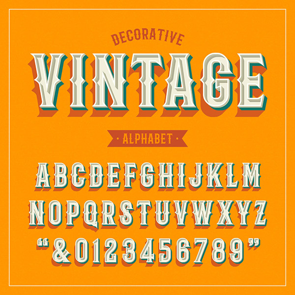
Vintage lettering comes in many different styles and varieties. Essentially, if the letters are created to give the appearance or replicate the design style of something old, it could be considered vintage or retro.
There are many different ways to use vintage lettering styles or fonts. They’re appropriate for branding, signage, product packaging, advertisements, and more.
→ Find resources at Vecteezy with vintage lettering.
7. Gothic or Blackletter
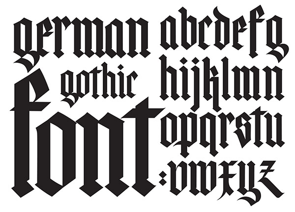
Gothic lettering (sometimes called “blackletter”) is a particular style of calligraphy. It has a very distinct and ornate look. Because it was commonly used in medieval Europe, Gothic lettering evokes feelings that date back to that era.
Because the style is so strong, Gothic lettering works well when paired with other styles like sans serif. It’s an appropriate choice for signage, apparel, branding, posters, and more. One of the most common uses of Gothic lettering is in tattoo designs.
→ Find resources at Vecteezy with Gothic lettering.
Final Thoughts on Lettering Styles
While this is not an all-inclusive list, it does cover several of the most common lettering styles that designers and artists can use. Whether you’re creating something by hand or working digitally, understanding the different letter styles available will help you create your best work. The principles and ideal uses apply regardless of whether you’re using custom lettering or simply choosing a font of that style.
Lead image by minerva-studio.